A Corn-y Makeover
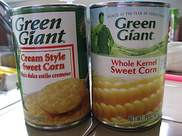
Okay, these aren’t exactly the same but still, the Jolly Green Giant’s corn product packaging has gotten a makeover.
The new design looks fresher with the green fields and a close-up of the corn kernels. Thankfully, the Giant’s green legs and unmanly booties have been covered up. The typeface of the main wording went to a sans serif font which What the Font identifies as Highlander. I think not, but I can’t id the font either.
