Style Tips from Bath & Body Works
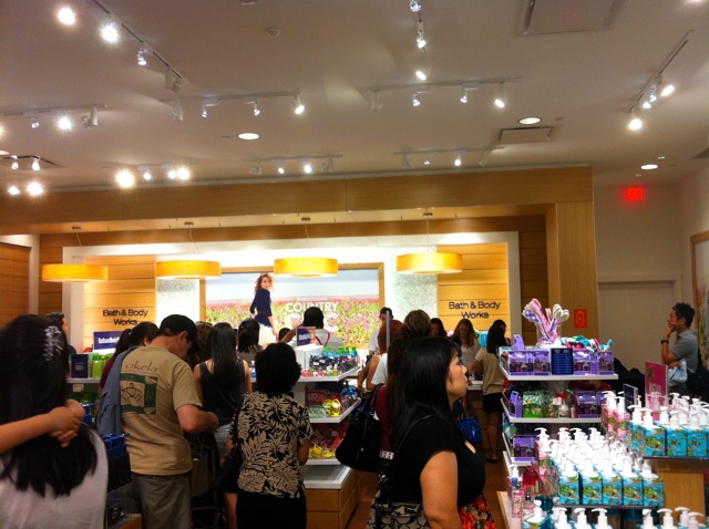
Visited the new Bath & Body Works at Ala Moana and like most major retail chain openings in Hawaii, it’s still packed with people. Since shopping for actual Bath & Body products is simply too hard in this crowd, I took some style tips from the store itself.
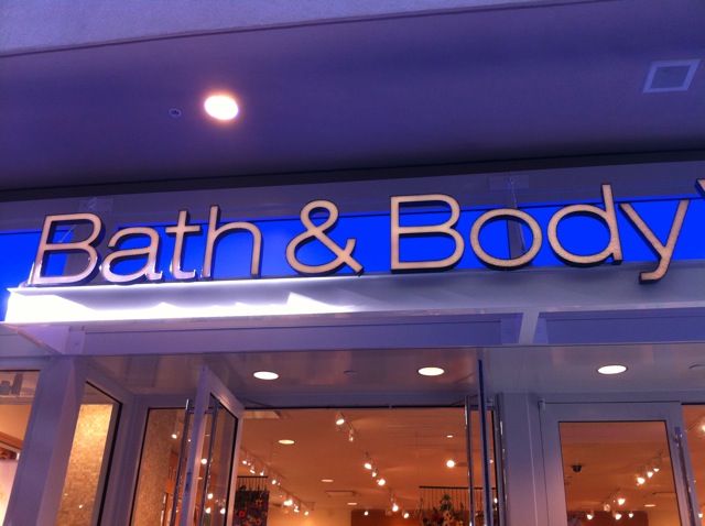
Nice blue accent in the signage. Recessed lighting above the signage provides emphasis and contrast. Forgot to look what kind of bulbs were used. Probably CFL, not LED.
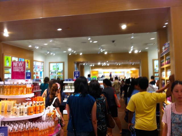
Let’s get the obvious out of the way. Yes, the store is still crowded. Moving on… Neutral wood tones and white walls. Combination of recessed and track lighting. The shelves match the white and wood tones.
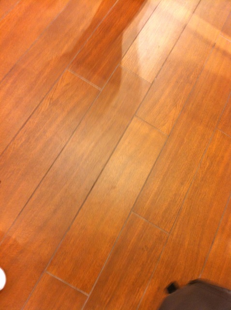
Hmmm, what kind of flooring is this? A wood laminate? Actual hardwood is probably too expensive.
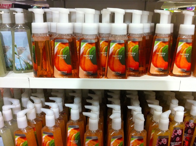
Oh, Nectar Mint. Sounds like a new scent. With the wide palette of colors throughout the product line, no wonder neutral colors for store hardware are used to minimize contrast.
By the cash register area, the oversized ceiling light fixtures project an amber hue that matches that lighter maple wood. More importantly, I think the lights provide focal points to create queues for each register. The fixture’s round shape helps offset all the square, right angles throughout the store.
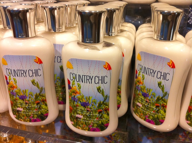
I like how these silver capped bottles of colorful Country Chic lotion are on glass shelving near the entrance of the store. The silver and glass is a striking combination and the translucent glass shelves near the entry way lends an open sensation, not building a barrier for incoming shoppers.
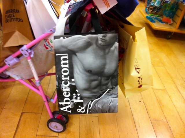
Thanks for the styling tips Bath & Body, but now I have a tip for you. I really can’t remember what the Bath & Body shopping bag looks like. With all the shoppers on a scented buying frenzy, memorable shopping bags should be abound as free advertisement ala Apple and Victoria’s Secret. It doesn’t have to be as extreme as Abercrombie & Fitch shopping bags, but you get the idea.
