Kicks Analysis 2013 #4: Shoes of Champions
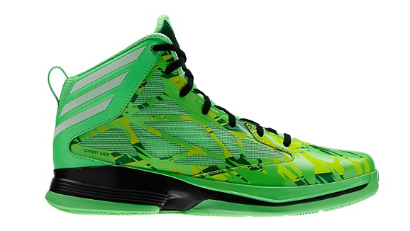
Continuing the trend of bright and bold team colors of 2012, twenty thirteen also mixed in retro kicks, primarily from a guy named Jordan. Overall, I like the chance Adidas took with their camo-based unis. I particularly thought the mint green of Notre Dame was something you had to stare at (for good or bad). Here’s the matching Crazy Fast in Green Zest.
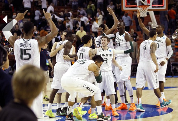
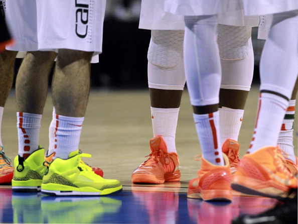
Miami rocked crazy colors with no one team shoe.
And if your team colors happen to match that of the Chicago Bulls, it’s BRED all day baby!
Kicks Analysis 2014 #4: Shoes of Champions
April 2, 2014 @ 12:47 pm
[…] with 2013, sneakers of 2014 continue the bright-is-better theme with matching team colors […]