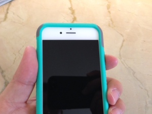
Initial Thoughts About the iPhone 6
After a few days using my iPhone 6, here are a few observations and thoughts. I went with the 4.7-in screen iPhone 6, wary of the large 5.5 iPhone 6+, but I did succumb and maxed out memory.
It’s thin. Very thin. That’s the very first thing you notice when you pick up the phone. The rounded edges make it feel even smaller if that makes any sense. It’s almost too thin making the iPhone a little tricky picking it up off a flat surface. Without the rounded edges, you wouldn’t have space to grab the phone.
The antenna “lines.” I still dislike the cutouts made for the antennas. Not stylish but not as ugly as in initial leaked images. Once a case is on, all is forgotten though.
The floating text. That’s the way I describe the way the text looks on the iPhone 6 screen. It floats. The text just seems closer to the screen surface, almost like it’s on top of the screen, hence the description of floating.

The right side power button. I have to break my muscle memory habit of reaching for the top to sleep the iPhone 6. The power/sleep button is now on the right edge. It’s too symmetrically placed with the volume up button on the left edge so if you’re using your thumb and index finger to squeeze the power button, odds are you’ll also increase the volume.
Freaky fast focus. That’s how I describe the phase detection autofocus of the iPhone 6 Focus Pixels. In camera mode, pan the iPhone 6 around and you won’t see that yellow focus box appear as with the iPhone 5. Yet, everything will be in focus. Yes, it’s that fast. Occasionally, the focus box does appear or you can tap to focus, but in general, the focus is so fast, you don’t wait for the focus box to appear. Just snap and go.
Two handed or one handed. That’s the biggest question of the newer form factors of the iPhone 6 family. The iPhone 6+ is guaranteed to be a two-handed operation. Unless you got mitts the size of Kawhi Leonard, there’s only so much your average sized hand can do alone on the 5.5-in screen. But you know what? I’m finding that the 4.7-in iPhone 6 almost needs two hands to use comfortably. Sure, you still can do almost everything single handedly, but typing is way easier using two hands. On my iPhone 5, I used to be fairly okay tapping out messages using one hand. I’m having a little harder time on the iPhone 6. Enough so that I’ll want to use two hands to cut down on mistakes. Sure, iOS 8 helps fix mistakes, but it’s not quite the same knowing you are making typos. Reaching the top of the screen on the iPhone 6 requires a different hold and grip. I can’t poke the corner of the iPhone in my palm. I have to lay the phone on my fingers. So either with the 6 or 6+, using two hands is a reality.
The mute switch. Yeah, big deal, but I like the feel of the new mute flip switch. When toggling the switch, there’s a more solid feel to the flip. The “distance” of the flip is smaller and just feels more “confident.” Like I said, big deal, but it’s noticeable.
September 24, 2014 @ 9:33 am
You gotta be sure you can do “one handed typing” or why have a phone that can browse the web? Hehehe. Try SWYPE! It is the big reason why I love using Android and every time I considered changing I couldn’t do it. The small phone and having to tap tap to type just never worked well for me and my large fingers for very long.
September 24, 2014 @ 11:46 am
in iOS 8 , can finally install other keyboards, Swype being one of them. I tried a similar product, Swiftkey, and am amazed at its accuracy.
September 24, 2014 @ 11:58 am
Swiftkey doesn’t work on an iPad.
September 24, 2014 @ 12:08 pm
bummer, yeah the “flow” feature only available on iphone or ipod touch http://swiftkey.com/en/keyboard/ios/