The New Look of Pulp
Notice anything different around here? Actually, Pulpconnection has been different since the end of August, but I just didn’t have the focus to summarize the changes. So on a quiet Sunday morning with a cup of Nespresso, I’m motivated to list the changes.
New Look
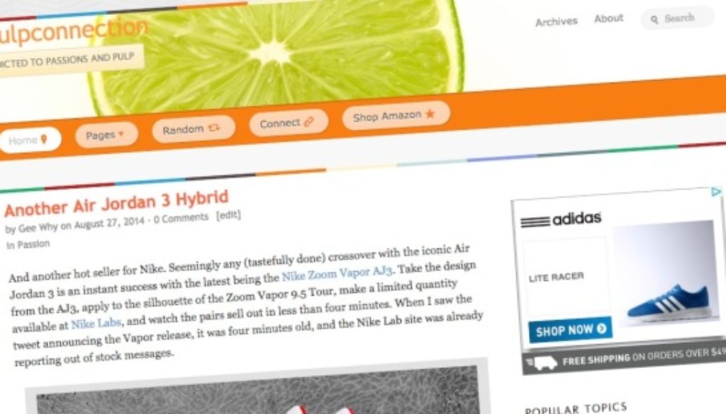
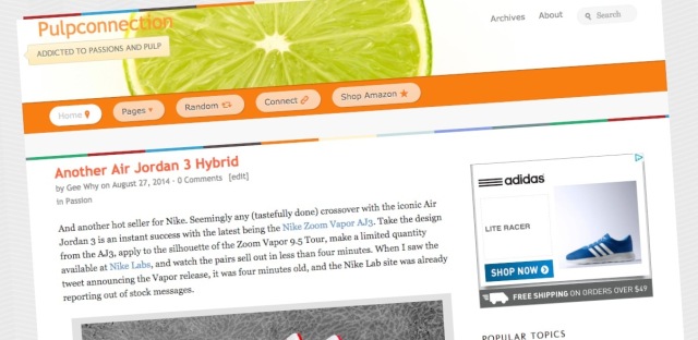
First and foremost, you’ll notice the new look of Pulpconnection. For years, I’ve used the Thesis theme then added the Chronicl look. This was a fun, playful combination.
While I’ve been a fan of the Thesis theme since 2009, I wanted a fresh new look. Thesis is still awesome, but I didn’t want to spend the time building my own look using Thesis 2. So while wandering around the web, I came across On Topic by WooThemes. What struck me about On Topics was its “bigness.” Everything looks so big and easy to see. This readability aspect was the biggest motivator to switch. I love my blogging bling, but all those widgets become distractions. I still have them, but they’re on the bottom of the page leaving you the readers a less cluttered view.
Along with widgets only in the footer, On Topic features a header that moves. On the home page, the “header” is vertical, but on posts and pages, the header goes horizontal, allowing for more space for content.
Customization of On Topic is available though much more limited that with Thesis. Thesis still provides way more options to customize aspects of your WordPress site. I’ll miss that about Thesis. WooThemes includes lots of Google fonts with On Topic though I’ve seen strange characters suddenly appear. Not sure what or why.
I also changed Pulpconnection’s home page to show excerpts of blog posts instead of full posts like before. I like the way On Topic displays its excerpts with the featured image. Sorry, you need to click on the Continue Reading button to see the full post.
New Menus
I’ve changed up some of the menus since On Topic has less options for menus than Chronicl. I spent some time and filled out my Travels section including more trips from the past. I also started adding my annual Kicks Analysis series. The most interesting addition is in the Around Hawaii menu. Click on that to see a map of Hawaii along with geo-tagged Pulpconnection posts.
Favicon
Yes, Pulpconnection now has one. See that 16×16 pixel image of oranges in your browser bar? That’s the favicon for Pulpconnection created with the Favicon Generator. The green limes weren’t recognizable in a favicon size so oranges it is.
DreamPress
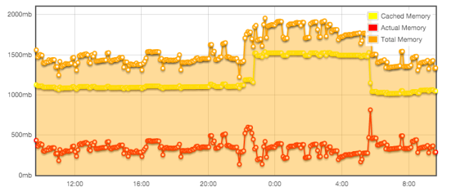
Like I already mentioned, Pulpconnection is now using Dreamhost’s DreamPress managed service. For its price, I don’t how you can compete with a VPS. I could never afford the 1.5+ GB of memory consumed by this site.
WordPress 4
To compound all the changes, WordPress 4 coincidentally released while all the above was going on. So why not make things harder? Yup, upgraded to WordPress 4.
What’s Left
As always, there are things to do. DreamPress includes Varnish, but I understand the simultaneous use of a caching plugin and Cloudflare is possible. Not sure if using all of these makes sense, so I’ll take this slow.
Lastly, I started looking into email subscription services. I haven’t made a choice yet since they’re different. WordPress’ JetPack includes an email subscription widget (which is in the footer) yet it doesn’t provide a simple URL link to sign up with. The venerable Feedburner has had email subscriptions forever and provides a link. Then there’s Tiny Letter. It’s like neither JetPack or Feedburner, allowing for email newsletters unrelated to blog posts. I’m gonna drag my feet on this one, trying to figure out the best pulpy answer.
And there we have all the changes making the new look of pulp.


