That Was Sweet
You had to love UH’s game against UCI. Two buzzer beaters to end each half and Hawaii walked away with the victory!
You had to love UH’s game against UCI. Two buzzer beaters to end each half and Hawaii walked away with the victory!
I really hope a zombified anteater is part of this eight-week course titled, Society, Science, Survival: Lessons from AMC’s The Walking Dead. Yes, this is for real as four UCI instructors “will take you on an inter-disciplinary academic journey deep into the world of AMC’s The Walking Dead.” The cost of attendance is free but a weekly time commitment is expected along with quizzes.
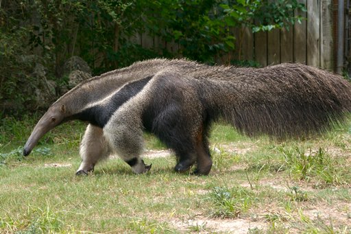
Can you imagine a horde of undead anteaters chasing you down? Truly frightening.

The new UC logo is interesting if not controversial. While I do think an updated look is in order, the new monogram might be a tad too progressive. I do like how this video explains the design inspirations.
[vimeo 53530934 w=470 h=264]
I think the initial choice of colors might have made the new look harder to embrace, but I do like the color variations shown in the video.
But really, how can this logo compete with the good old Anteater of UC Irvine? Now this is a logo (and mascot)!
 Just last year, my other alma mater underwent a similar update with its school logo. Joining the traditional, circular seal is this clean, modern logo.
From a visual point of view, the newer UC (and Iolani) logos are much easier to use and see. The details of the crest and seals just aren’t discernible. I think some killer logo items would quickly change opinions about the UC monogram. Can’t wait to see some new UCI gear.